As a digital director, I have the opportunity to art direct and train noobie graphic artists all the time. Having taught graphic design at U.S.F.’s Educational Outreach program, I can easily spot the work of an amateur designer still a wet behind the ears. Here are the top five design mistakes new graphic artists make in their web graphics.
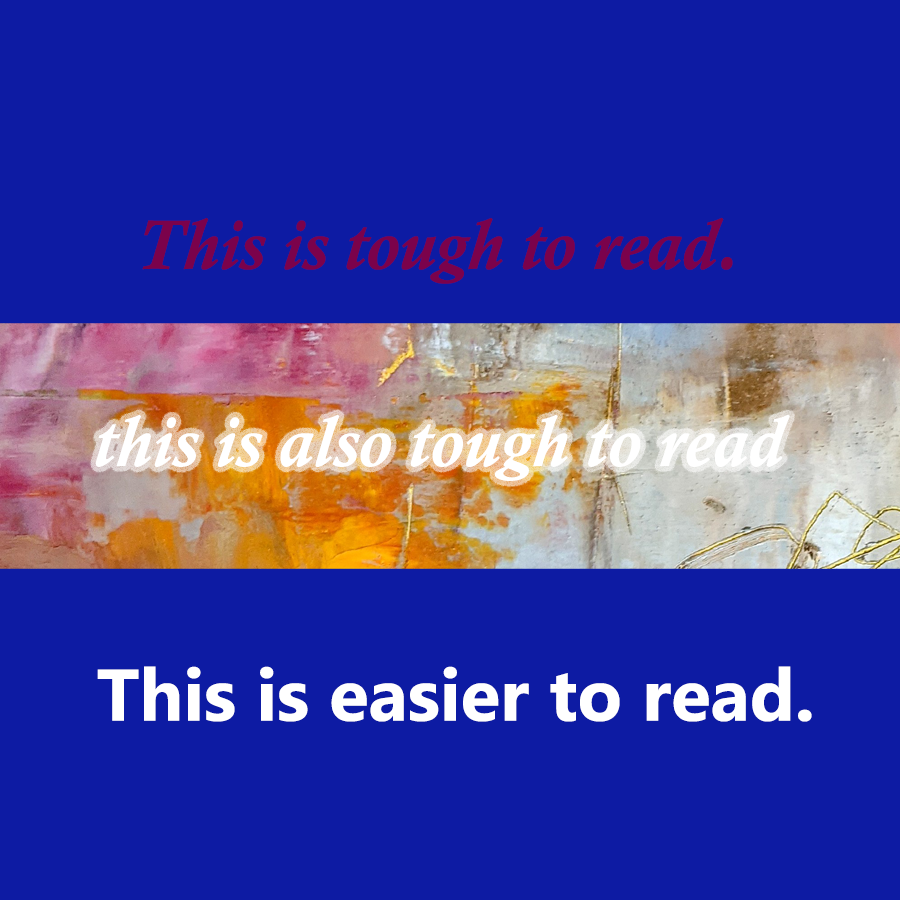
#5. Not Enough Contrast
For some reason, new graphic artists seem to make text difficult to read. One way many accomplish this is to make the font color too similar a value to the background color. Or they place text over a busy background without doing something to make it stand out (outlining the text, adding a contrasting shadow, positioning a solid color behind the words).
Another issue I see is that new artists put an outer glow on light text or a drop shadow on dark text even if there is already the maximum amount of contrast between two colors. If I have to strain my eyeballs to see the text, there is something wrong with your design.
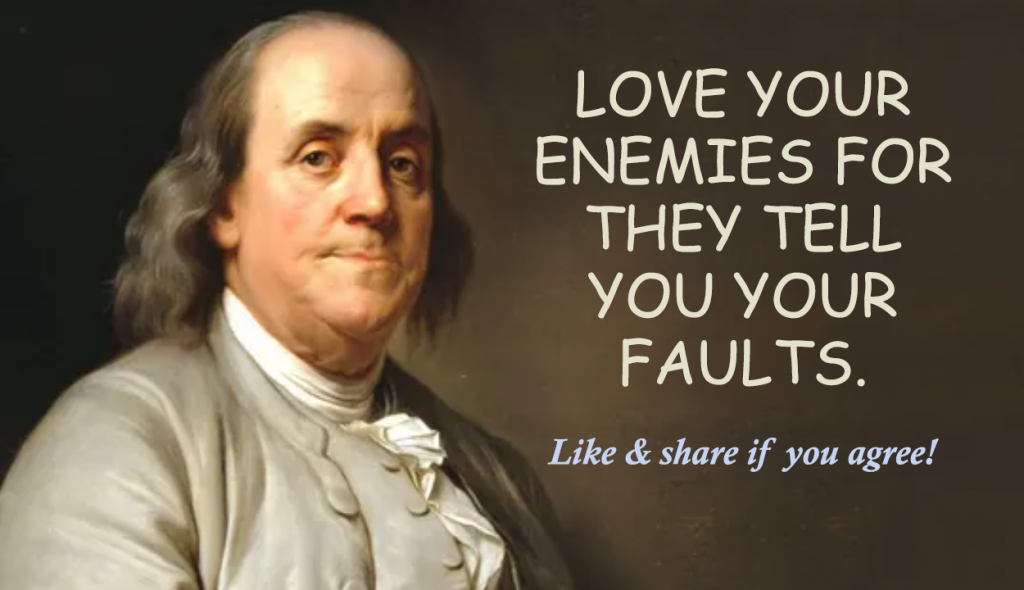
#4. Ugly Fonts
Remember the SNL skit on Avatar’s use of Papyrus font in their logo? I’m sure anyone not a professional graphic artist may not “get it.” But, the skit brilliantly speaks to the nails on a chalkboard use of ugly fonts. If you’re a graphic artist and you’re using Papyrus, Comic Sans, and any other weird out of the box font, please stop.
#3. Nothing Aligns to Anything Else
Okay. While this amateur design trait is better than the #1 noobe problem, it still screams novice. Elements should not be randomly dropped on the graphic all willy-nilly. Every element should be strategically positioned to align with at least one other element.


#2. No element is more important than the others
This is a huge mistake I see all the time. You have an event and all of the text is 14 point. If all the text is the same size, and there is no white space distancing less important elements, then the viewer sees one big block of unenticing text. Nothing jumps out to grab the reader’s attention. Nothing draws the viewer in to explore or to be led on a journey through the image. The first thing the artist must do is capture attention with a big hook. If he or she is interested, the next largest text should reel them in and keep them on the page. If they’re still interested, you can give them the address or the web site address. But that information is not as important as the headline, and therefore, it should be smaller and less noticeable.
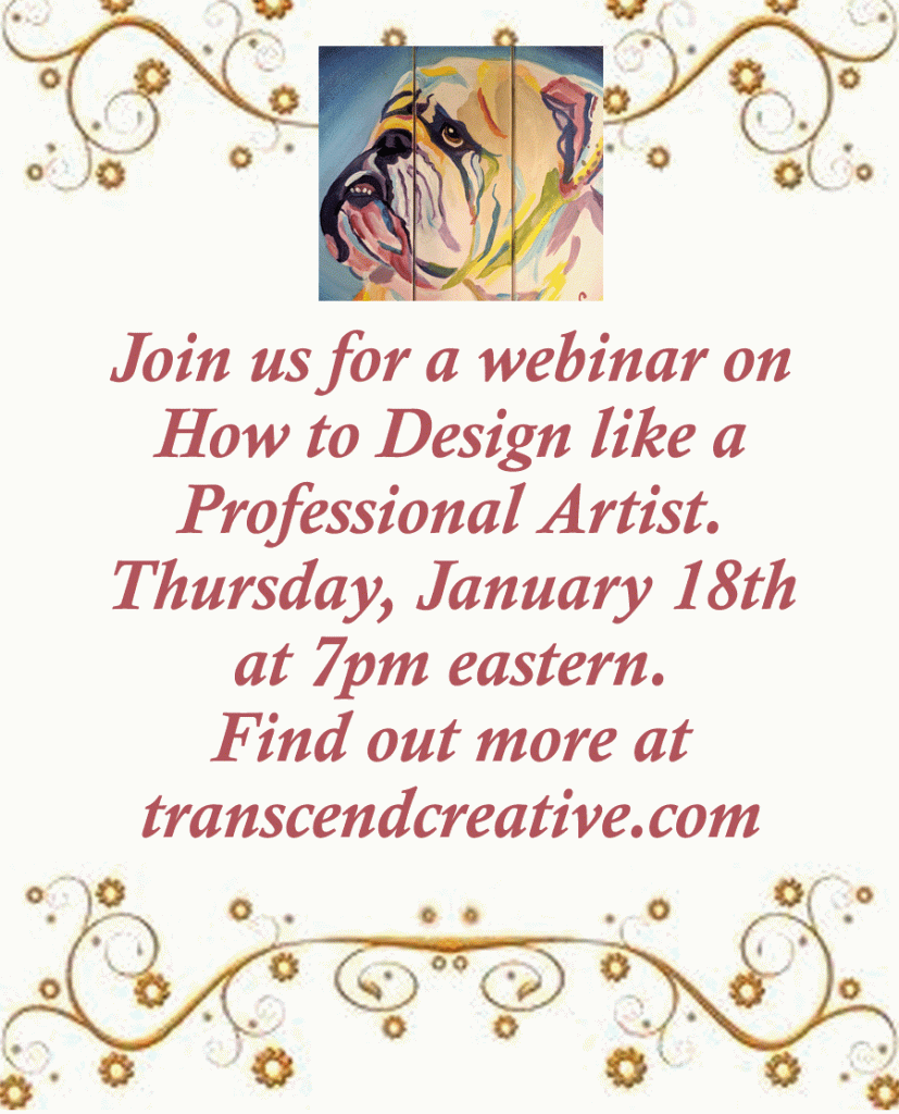
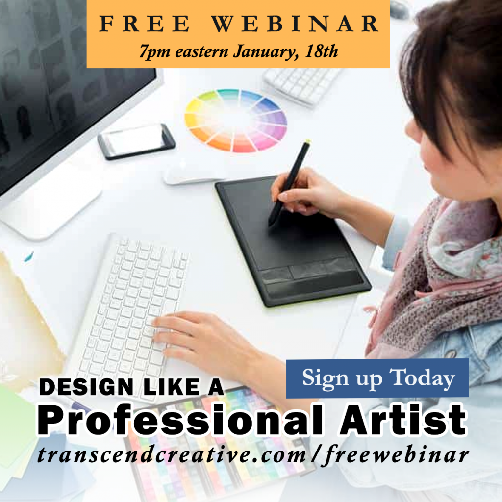
#1. Center Everything
Without a doubt, the most amateur design feature I see is that everything is centered… all the text, all the images, both horizontally and vertically. There is no white space for the eye to rest. This also reinforces problem #2 where nothing is more important than anything else. It’s okay to rag right or rag left. It’s best to set your focal point off to the side. As a matter of fact a cardinal rule is to NOT CENTER THE FOCAL POINT. The artist should draw the viewers attention to an intersection of thirds. This means, divide the graphic in thirds, both horizontally and vertically, and put the focal point at one of the intersections. Centering is fine if done with purpose. But it is really tough to read when all the text is centered. It’s even worse if all the centered text is capitalized. Refer to the previous two graphics and you’ll see what I mean.
Bottom line is, if you want to upscale your graphic design artwork, don’t use typical fonts, don’t center everything or randomly place elements on the page, don’t type everything in the same size font and minimize the type of fonts (serif/sans serif) to two possibly three. Also, give breathing room and separate the more important elements by size, space, color, and position. Lead the viewer down a logical path to conversion.
